Tuesday, November 25, 2014

Studio Hacks- Ruler that does not move and Drying rack

Working hard or hardly working? It's been the latter for a while now, and finally this week I've been putting in my concentrated efforts in the studio to get ready for events and Christmas. Its fun to get back to working when you have some events to look forwards to. My movable press will be hosted at the Frame Gallery in Bryan, TX, for Dec First friday. Visitors to the gallery will be able to print a small keepsake card while listening to some good music and browsing some great art in the gallery. I've spent time matting and packing my small prints for the night. It's grown into a nice little pile by now. 


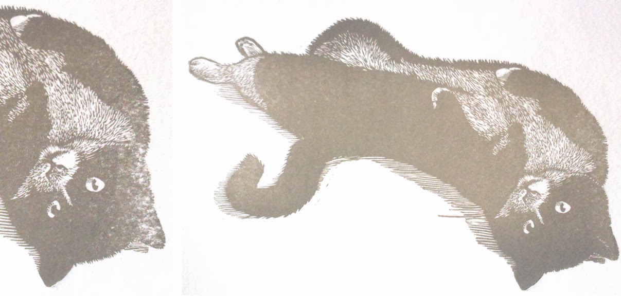
I also had a vision of a winter scene that I really wanted to execute before Christmas to send out as gifts to some friends far away. It's moving in the same direction as my last engraving with a donkey; experimenting with composing and carving landscapes. 


I felt quite lost at how to represent snow and snow covered trees in black and white, so I only did a loose sketch on the block before carving. I thought maybe I'd try some stippling, but then quickly figured I did not have that kind of time to use for this block so started carving lines instead. I still ended up using stippling in some small areas to vary the mark making a little bit. (All the photos are snapped with my cell phone, so excuse the quality) 


It took a while to carve the image with the kids running around, but it was finally done yesterday and I took the time to set it on the press at night and tear paper. Which brings me to Studio Hack # 1

Ever been tearing paper with an average metal yard stick? It's flimsy and likes to move around on you when you tear paper making for curved tear lines. I finally had enough, and decided to do something about it. I have a short ruler with cork on the back, which is lovely to use, so I wanted to transfer that idea with the least amount of effort to my big ruler. I didn't have any cork at home, but did have a bit of faux suede from Joann's, which was the perfect material to use. I cut a strip of it about the width and length of the ruler, used some spray adhesive sprayed on the back of the ruler and carefully laid the fabric on the top. 


Presto chango, ruler that does not slip ready to go! The fake suede is perfect on the paper, it has a nice grip and needs now minimal pressure to stay put when tearing paper. You can even see in my picture that the cut job for the strip is less than accurate, but it still works great. I'd assume that any fabric that has some tack against paper would be good for this. 

Now back to printing! Here's some pics of the block on the press and printing. Ink, was a mix of some black and blue. 


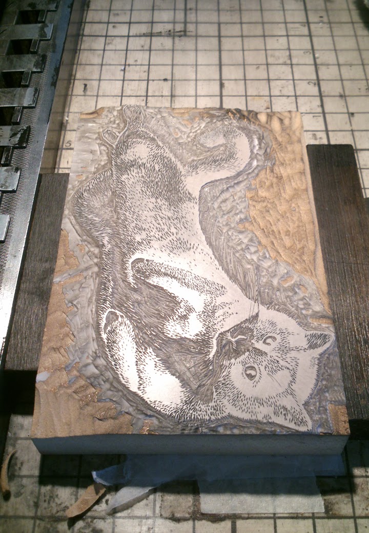
I decided to try to print this on my Korrex flat bed press, which as usual turned out to be a great learning experience. I've always printed my engravings on my proofing press or the adana mini press,  but since this was "larger" (4x6! lol, for me), I thought the Korrex would be good for the job. Getting everything ready to print took a lot of proofing and tweaking and makeready, but as I went along it came apparent that it would be impossible to print this with only the press rollers. Which I probably should have known before starting.


The two issues to solve were:
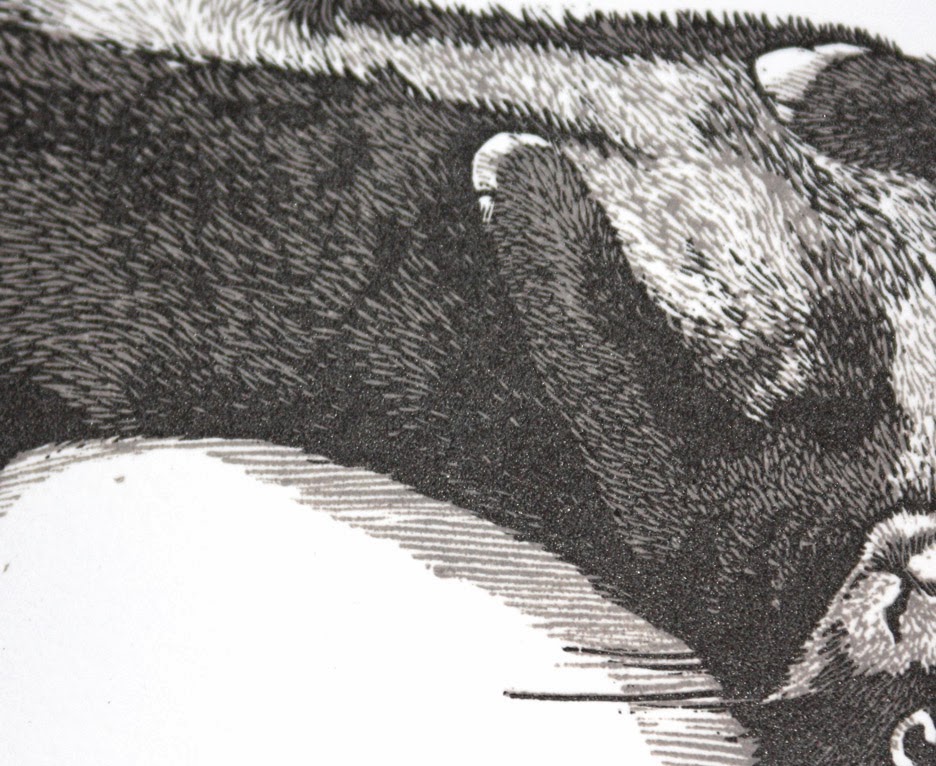
1- the surface of the block was not even from the manufacturer. The top and bottom edges had big dips in them, making it impossible for the press rollers to ink them up while inking the rest of the block properly.
2- the block has both areas of very small detail and large solids of the tree trunk and sky, where varying degrees of pressure and amount of ink is needed to transfer the image properly. 


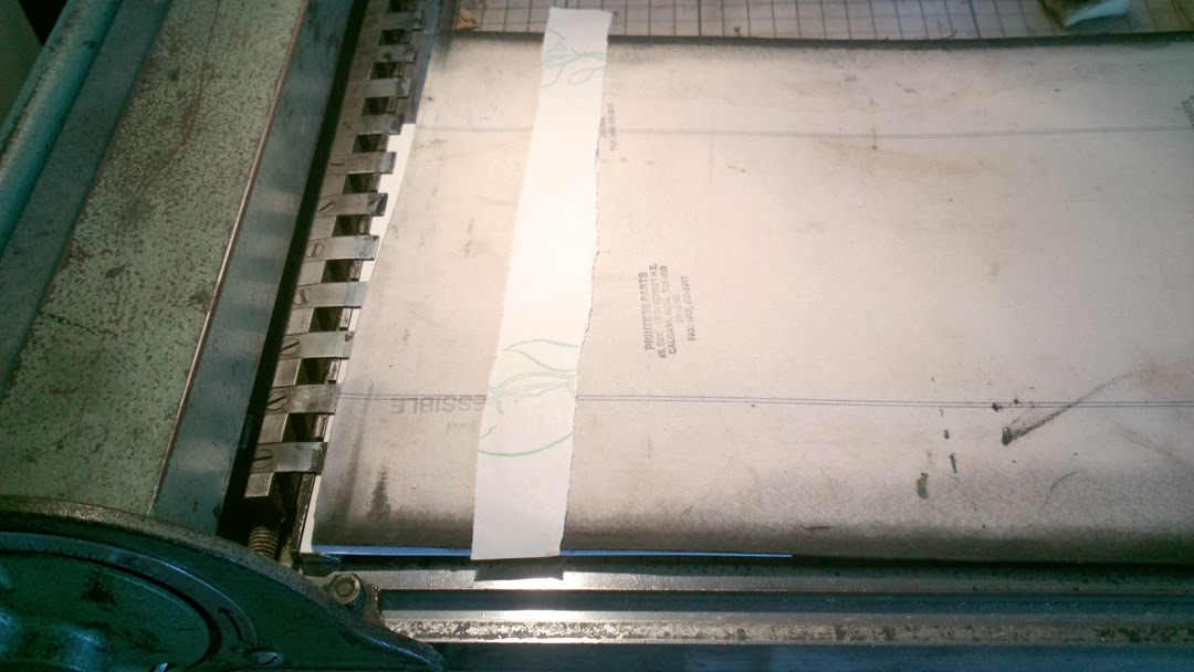
First I needed to use a bunch of paper to get the block level so that it would ink up evenly. 


Then I used a sheet of transparency for the makeready. This was a sheet that was passed through the press under the sheet of paper every time. It was easy to add tissue to by taking the proof, then tearing pieces tissue paper and putting glue on it, then placing it glue up on the print and placing the transparency on the top of the print and tissue to glue them together. You can see the final makeready with lots of tiny tissues stuck to it in the picture below.  


After all the fussing with tissue paper all over the place, I still needed to supplement the press rollers by inking by hand certain areas that were lower. As printing went along, it ended up just being easier to ink the whole thing up by hand and not adding any more ink on the press rollers. When I do this the next time, I'll remove the rollers and just hand ink. 


Studio Hack #2 Drying rack
If you are printing at home and don't have room for a normal drying rack what do you do? Use a clothes drying rack instead. We got this while in Germany for about $20, and the three racks go down and the whole thing folds to about 3" deep so its great to store behind a door or in the garage. And it obviously doubles as our clothes drying rack too. Here is one I found on Amazon.com for sale. 

Yeah, it's only 3 levels, but since I print small, I can fit a lot per shelf, and when its full, I just start another layer on the first one. But there would be no room in our house to keep anything that does not fold down and now I can print, transfer my prints to this rack and let them dry out in the garage, without worrying about the kids getting their hands on them or trying to move around a drying rack in an already cramped space. 


Here's a last shot of the prints drying. They'll be available in my etsy shop in the next week or so.


Lastly some announcements: I'm included in both the Wood Engravers' Network Triennial Exhibition and the 77th Annual Exhibition of the Society of Woodengravers. The first is showing for three years at various locations in the US, and the other will be up in Great Britain at several galleries. You can find the locations and dates from the respective links above.

If you are in the College Station are in December, come and visit me at the Frame Gallery in Downtown Bryan for first friday. I will be setting up from 5.30pm to about 9pm.
I hope everyone has a great Thanks giving break! I'll try to post some pics from first friday sometime after the event. I've got one more print hack to share, but this post is long enough as it is, so we'll save it for next time. 


Tuesday, June 3, 2014

Guest Artist- Heather McCaw


Today as promised, I am featuring a guest writer, friend and fellow artist Heather McCaw. Heather and I met about two years ago, when she moved to Germany and was interested in learning some relief printmaking. I was glad when she found me since I hadn't met any other "serious" artists in the area and was happy to finally have company.

She came over to my studio about once a week when possible and we would talk and carve together and I'd teach her little things here and there as we went along.

I thought it would be fun to have her write about the last and most complicated print she did in my studio before it got packed up. It was a really fun reduction linocut with a fun twist. I'll let her tell you all about it:

"Beer's intellectual. What a shame so many idiots drink it." ~ Ray Bradbury 

This is the third in my series of prints celebrating the "six beverages that changed the world." I have a hard time figuring out which of those beverages are my favorite. What makes me happier, a perfectly brewed cup of coffee in the morning or a nice Italian red with rich pasta? A pint of IPA sipped in a quiet English pub? A good Bourbon, cozily sampled with friends in an upscale bar or a Coca-cola with a burger and fries? 

Clearly, each of these drinks compliment different times of day, moods, and atmospheres. It's no wonder human beings had to keep inventing new libations to love. For me, a beer is best enjoyed after a hard day's work. It's the kind of drink you have with others, in public settings, a friend's barbecue or a bar. In America, it used to be considered a working man's drink (emphasis on the man). Women didn't drink beer. They sipped wine or cocktails. Now every gentrified neighborhood in the country has its own microbrewery with a loyal following of self-proclaimed beer snobs, both men and women. 

My husband and I are just such snobs. Imagine how much fun we have had sampling different beers in England, Germany, and Belgium since we moved to Europe two years ago. 

This is why I was excited to find this quote by Ray Bradbury when I was playing around with ideas for my beer print! Yes, beer can be as sophisticated, varied, and complex as wine. 

Now on to the process. 


First, I had to play around with a couple of sketches. I decided on a composition with the beer bottle on the side and the lettering curved above and below. The words "what a shame" would be on the beer bottle itself, so that the eye flows from the top to the bottom of the piece in a kind of backward "c". This was a difficult quote to incorporate into an image, because it is not just one sentence. That's why the beer label proved useful in the design. I wanted the image to have a rustic, old-timey feel, so I chose lettering that reflected that.  


Since I wanted to use three colors, I used two plates. The first printing would be in light yellow, then I would carve out everything on the first plate I wanted to remain yellow when I printed on top in light brown. The second plate would be for the rest of the lettering. Step one, step two, step three. 


Coming up with the yellow color was the hardest part of the inking process. Because my press is so small, I printed this in Mirka’s studio. I thought I mixed enough color to bring with me, but I quickly ran out. We tried to mix up some new color, but her white was a different brand and it kept coming out too orange. After trying and failing to get the same color, I eventually had to run home and grab my white ink and bring it back with me. You live and you learn, I guess! 


After carving out the spiral design and other parts of the first plate, I printed the light brown. Then I switched to the second plate and printed the second shade of brown. The second shade of brown was also tricky to mix. At first it was too black, then too red, then finally just right. 

I don't know why I didn't think about attributing the quote until so late in the process, but at the end, I had to carve out a stamp so that Ray Bradbury's name would appear on the prints. 

And then.... drum roll please.... the final touch was adding these red foil stars. I can't take credit for the idea. It was Mirka's suggestion and she was right on the money because I think they look totally snazzy! 

This was my first attempt at a reduction print. I had always been a little afraid of how much I would need to think through it, but this design was basic enough that it was fairly straightforward. I will definitely do more of these! 


If you’d like to see more of Heather’s artwork she has a great website and etsy store, where the Beer-prints are also available. For the next post, I'll write more about my current escapades in Finland making more (lo-and-behold!) engraving blocks out of apple and juniper. I also had a very simple setup to share on printing relief works. :) Talk to you soon!

Friday, April 25, 2014

Stink Bug Print Before We Move

Happy Spring! The easter/spring bunnies are out in our town and the flowering trees are slowly starting to change their blooms to green summer garb. I've completed my last little engraving for the time being. :( It's time for us to say goodbye to Germany and pack our bags and move back to the States. I have a lot of preparing to do in the studio this week before the packers come, so figured I'd stop early rather than try to work until the last minute and then panic. Moving prints, paper and presses is pretty nerve-wracking when you just have a bunch of random guys show up one day intending to box up your whole house in a day or two! They are not used to this type of stuff, so everything just goes is cardboard boxes with some packing paper unless I specify otherwise or organize and get things ready in advance.  

But you really want to see the print and not hear about packing boxes don't you? The last bi-annual Wood Engravers Network newsletter and bundle came in the mail about a month ago and I was so inspired by the bundle prints that I had to make a print to participate in it again. (Our newsletter comes with a "bundle"of prints which consists of editions submitted by members and shared to all to enjoy our craft. They are meant for educational purposes and for us to enjoy, but not for sales, speculation or criticism.)

I had this idea for a bug on an acorn and thought it would work well as a tiny little engraving. The block ended up being 1.5x3" big. With it being the last edition in my current studio, I thought it would be easy to print, but still had a lot of problems getting it dark enough. It's just the paper that I've been choosing. Most of the paper I have has too much texture and is hard to print an even black (at least with my experience level). With some adjusting, it worked so that I was happy with the impression.   


Above is the block after printing and below is a print and some tools. The actual edition ended up being 120 and I kept the extras that didn't make it to 130 and labeled them as Artist Proofs. The extras will be available in my Etsy store after our move. 


 I also took some video clips of the process of printing and uploaded for you to see. Just a fun little tidbit, taken with phone in one hand and brayer in other. Damp packs are something I haven't talked about in a while, so at the end I show you how I did mine for this print. Its a very informal damp pack.


And look at what came in the mail a week ago! My friend Annika from Studio Unicco in Finland sent some cards printed with my designs. They are so pretty and perfect for summer. There are a lot more, but these were the only ones that had english language texts to them. More of our cards are available for purchase at the Paper Shop in Helsinki and at the Kiasma museum shop. Pretty fun! After the move, I'll try to add a couple of these too in the Etsy shop.


While we're on the news side of things, I should say my prints are/were also on exhibit at University of Dallas Haggerty Gallery at the Juergen Strunck, In Retrospect: 45 Years of Teaching. Its a pretty fun exhibition featuring works from UD printmaking alumni. Glad to have been a part of it, but sad I could not make it to the reception.

I will be out of commission for a couple months, so I thought it would be fun to fill in the gap with something special. I've been harboring a renegade painter turned printmaker in my studio for the last year and was going to have her write about her latest print (incorporating a less traditional media in it!!!). She'll tell you all about it in the next post!

In the mean time, happy printing and happy spring!


Tuesday, February 11, 2014

Reduction Engraving- Part 2- Problems with Printing


If you missed my last post, I have been working on a commissioned portrait of a kitty called Jemma for a wonderful family in WA. It is a two color reduction engraving printed on Lettra 300gr paper. The first color was a medium gray and was printed a couple of weeks ago. The second color was supposed to be black, but things don't always go the way they're planned… The last weeks have been a great learning experience and a testament to the friendly and supportive community spirit of printmakers.

Before I begin with the "real" problem, let me add in here, that when working with both mounted linoleum and resingrave I run into issues of the condensed fiberboard under the block not being completely uniform and changing of the block thickness as the print run progresses. I'll show a couple of photos to illustrate:


If you look at the above left side photo first, you can tell that the right side was lower than the rest of the block, so it's not printing properly even though it's been inked well. To fix it, I just shimmy it up with torn up pieces of tissue paper under that part of the block. I keep adding layers and proofing, until the area prints evenly with the rest of the block. 

Sometimes the block will compress slowly over time and change the way it prints in the middle of the run. If you look at the above photo on the right, you can see that the side of the face is printing well, but now there is a lighter area the width of the whole cat in the middle that is lighter than the top and the bottom of the print. Again, editioning stops and I need to tear paper and shimmy the block so it prints more evenly. This is normal, and usually after about 50 prints or so the plate settles and stops changing on me and I can finish printing. The nice thing is that if its a reduction block, I can just keep the little pieces of paper in place in between carving, and then when I get around to the second color, the press is already set up properly to print. 


So now we get to the part of the learning experience. If you are not interested in a lot of technical talk, please just scroll down several paragraphs to the end of the post. ;) When the second block was finally to the point where I was happy with it I started proofing it. The problem was that the ink would just not transfer correctly.


Here's three closeups of the proofs. (The very top of the post with the face, and the two above images.) I got a lot of little pit marks and it seemed that the first color was almost repelling the second color. I've done my fair share of reduction cuts so far, and had never had this happen before. So during the first day of serious proofing I fiddled back and forth with a lot of things. My first hunch was that the gray ink had been loose when I printed, so the black ink was not adhering to it properly because it was stiffer. So I tried: loosening the ink, dampening the paper longer, adding more pressure, in different increments and combinations, but nothing was really taking care of the problem in a satisfactory way. I also cleaned the block with alcohol, just to make sure there was no residue left on it from previous printing (lol or hairspray used as fixative for drawing). Dampening longer helped, but making the ink too loose was not a good option, because when the ink was so runny it easily plugged up the smallest lines and then the engraving did not print properly, and for the same reason adding more pressure with loose ink was not a good option either.

After a couple hours of proofing, mixing inks etc. I called it a day and wrote to the Wood Engravers Network list serve to ask for some advice and ideas. A couple names of printmakers who are way more versed in reduction work than me popped up and I contacted both of them with a long email about what was going on and asking for advice. Sherrie York does beautiful reduction linocuts. I have been an admirer of her work for a while, and we emailed back and forth several times trouble shooting. I also got the guts to email Gaylord Shanilec, who works in large multiple & reduction block engravings. (Both of these artists are so wonderful I'll have to dedicate a separate post for each at a later point in time.) From Gaylord I learned that he had had a similar problem before when he used Setswell in his first color and he had been recommended varnish as an additive to give body to the ink and to help it settle better on top of the first layer. I thought that was a great idea, but had no varnish to work with and did not have time to wait for several weeks for it to arrive if I ordered some. The big eye opener was that Setswell, that I had used as an additive to the gray ink is a wax instead of an oil. I used Setswell because I was printing a large solid area of color and Setswell helps the color go on more smoothly. Because I thought it was an oil, I thought that if the consecutive layers are just less viscous, then they should print on the previous colors with no problem. But if the first color is waxy, and the second color was also waxy, you can imagine that the two just won't print on top of each other very well. So I felt a little stupid, not knowing what I was putting in my ink, but we learn as we go, right? (My disclaimer: I never used Setswell in school, since I was working on etchings back then.)

So now we are getting somewhere! I mixed a whole new batch of ink, a dark warm gray color, with NO Setswell. I used a Daniel Smith black relief ink and brown and white Charbonnel etching ink. This made for a rather loose mix, so I added an etching transparent base (which is super stiff) and a small dab of miracle gel. Now the ink was at a good consistency with some body to it.

Because the paper already had a layer of ink on it, I thought dampening the paper for a little (30 seconds) longer the second time around would not hurt either, since that seemed to do the most good during my first round of proofing. Even that short time mattered, because Lettra is so unsized and absorbs the water sprayed on it immediately. If I did something in between printing, like take these pictures, I could notice a difference in the way it printed. The more time it sat in between the towel, the darker/unclear it would print.


With these new measures I was still getting a little bit of the pitting, but not like before where it was repelling. Now the printing could be controlled with the right amount of ink on the block and dampening of paper so the problem had been effectively solved! The middle was still printing a hair lighter than the top and bottom, so instead of adding tissue underneath, i just added a strip of newsprint on top of the blanket on the press to save some time. (see picture above)

Here's a picture of how the block looks on the press, and when you remove it, the layers of tissue and paper underneath it:


Of course today, my little man refused to sleep in his crib, so he had to come and help mom print. Apparently it wasn't too exciting, since he was out in the first ten minutes. Thank God for baby wraps. I'd never get anything done around the house without them...


I hope that this post has been helpful to some of you working with relief prints. The lesson for today: Setswell is a great additive in relief work, but use sparingly or replace when doing multiple block work.   

I did end up ordering some varnish and will probably try that at some point, just to see how it changes ink transference from block to paper. I like to print on thicker paper if I have a choice, but getting areas to print solid without losing tiny detail work is always a (good) challenge.


Editioning is now finished for this image, and I am waiting for the last prints to dry so they can be cleaned up, numbered and signed. I ended up with a fair share of lost prints due to so much proofing, but will have the extra prints from the edition for sale in my Etsy shop in the next couple of weeks if anyone is interested. Above is a picture of the two colors printed separately and here is a closeup of the face with the two colors printed on top of each other. 


I am very happy with the way this engraving turned out and am excited to do more in the future. I think for the next project, I will work on a tiny print for the WEN members bi-annual mailing. I had an idea of a stinkbug on an acorn pop in my head that would be fun to do for it. Thanks for reading my blog and as always I am happy to hear comments and questions if you have any.  

Sunday, January 19, 2014

Studio Visit and Commission Work


It's January and I thought it would be fun to do a little studio tour and look at the portrait commission I'm working on. I got a request for a portrait of Jemma the cat in November. Because of holiday traveling, we agreed that it would be finished in February.
After settling back home, I have started this lovely carving and am in the process of printing the first color. The finished print will be a reduction two-color engraving on a resingrave block. First color gray and second color black. On the left you can see the finished sketch of Jemma on the 6x4" block. The original image I am working from is small and a little blurry, so I have about 8-10 other images that are being used for reference for color, fur patterns and details.

After the sketch was finished, I sprayed it with fixative and colored it with a blue permanent marker. That way I can still see my sketch clearly, but can tell where the block has been chipped away. Below: just starting carving the image.


The life of a stay at home mom/printmaker is not so glorious as it may seem. At this point I usually only get to work on carving the block after the kids go to bed. Hence the dark photo. I sit on the couch and use a tv-tray to work on. After I'm done, everything needs to be cleaned away before morning before the kids get up and get into everything. Once the baby gets a little bigger, I'll be able to schedule time during naps to work during the day. Here are a couple closeups on how the carving is moving along.


The first color is gray. So I am only carving out the background and white areas of the cat. When I'm happy with the block, it gets set on the press ready to be printed. The roller on the press can be moved up/down so I take a few minutes to figure out what is the right height for printing when you add the block, paper and plastic blanket on the press. I am using an old letterpress proofing press, which works perfectly for this type of work. It is relatively quick to roll up a block with ink by hand and print it, without having to fuss with the big press.

With the first color being gray, you'd think it would take me a whole 30 seconds to mix up some white and black inks and be ready to print. Meek, wrong. It took me about 45 minutes of adding varying amounts of black, white, brown and transparent and testing on a scrap piece of paper to get the shade I wanted. Well, maybe the black will be quicker for the next color. It's only black right?


Here's two closeups from the press. With the light hitting it just right, you can see all the detail.


And now to see the studio. You can click on the image to see it larger. Here is how I have everything set up simply but effectively. On the left you can see the press, with the block. Next to it on the other end of the table I have a piece of plastic that I mix and roll up the ink with. Moving to the right is a rolling table that has a mini etching press on it. It also doubles duty as the bad print detention spot. 

Now the good prints get to go and lay on the comfortable small card table set up in the middle. I use a piece of ordinary sheetrock (from Homedepot etc.) that has been cut into pieces to dry my prints on. Every time a layer gets full, I place another piece on top of it. The boards are heavy and made of plaster so they flatten and dry the paper very well.  You can see the extra boards waiting to be used next to the table (on the right). 


Now lastly there is the printing paper. It's stacked on the table on the right. I am using 300gsm Lettra to print on. The paper is fun to print with, but takes a little sweet talking to get it to print pretty. Soaking will make it too wet and print blurry, but a dry surface will not get good ink coverage. So what is the poor printmaker to do?

Misting is the best of both worlds. I hold the paper over the plastic bin and use a small mister to get it damp. The bin just catches the extra water droplets, so my floor is not all wet. Then I lay the paper inside a towel to even the dampness out while I walk to the other side and roll up the cat with ink. After inking, get the paper, place it on the block, place rubber blanket over block and print. Voila! one image is done. That then goes on the drying sheetrock with the good prints I hope and a new paper is dampened. Below: All the pretty cats waiting to be held down by sheetrock.


So far I have 2/3 printed. I am going to take about an hour tomorrow and hopefully finish these bad boys. After that I get to enjoy some quality time with the block again as the black carving is produced. Already looking forwards to that! I think it'll be about two weeks time and I can proof the second color. Stay tuned for that in the next post.

Hope you enjoyed the tour. If you'd like to see some closeups of anything or more in depth explanations please leave me a comment below and I can include it in the next post. See you soon!