
Today as promised, I am featuring a guest writer, friend and fellow artist Heather McCaw. Heather and I met about two years ago, when she moved to Germany and was interested in learning some relief printmaking. I was glad when she found me since I hadn't met any other "serious" artists in the area and was happy to finally have company.
She came over to my studio about once a week when possible and we would talk and carve together and I'd teach her little things here and there as we went along.
I thought it would be fun to have her write about the last and most complicated print she did in my studio before it got packed up. It was a really fun reduction linocut with a fun twist. I'll let her tell you all about it:
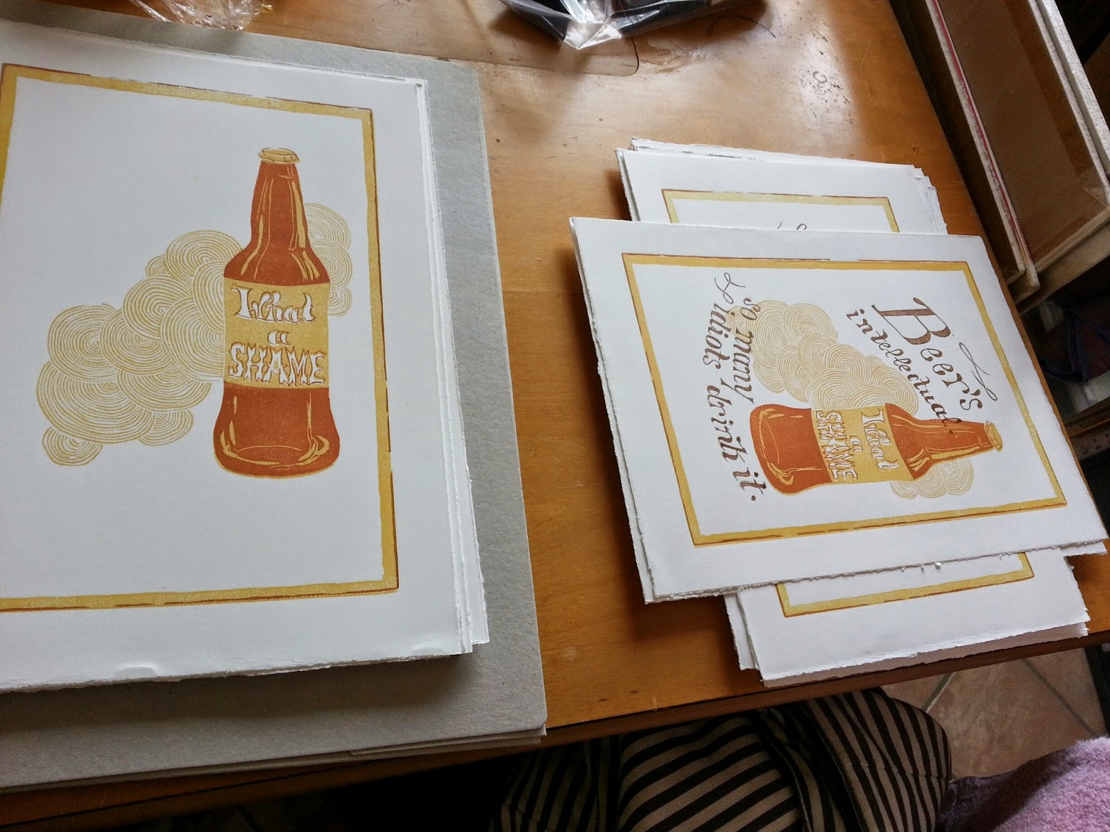
"Beer's intellectual. What a shame so many idiots drink it." ~ Ray Bradbury
This is the third in my series of prints celebrating the "six beverages that changed the world." I have a hard time figuring out which of those beverages are my favorite. What makes me happier, a perfectly brewed cup of coffee in the morning or a nice Italian red with rich pasta? A pint of IPA sipped in a quiet English pub? A good Bourbon, cozily sampled with friends in an upscale bar or a Coca-cola with a burger and fries?
Clearly, each of these drinks compliment different times of day, moods, and atmospheres. It's no wonder human beings had to keep inventing new libations to love. For me, a beer is best enjoyed after a hard day's work. It's the kind of drink you have with others, in public settings, a friend's barbecue or a bar. In America, it used to be considered a working man's drink (emphasis on the man). Women didn't drink beer. They sipped wine or cocktails. Now every gentrified neighborhood in the country has its own microbrewery with a loyal following of self-proclaimed beer snobs, both men and women.
My husband and I are just such snobs. Imagine how much fun we have had sampling different beers in England, Germany, and Belgium since we moved to Europe two years ago.
This is why I was excited to find this quote by Ray Bradbury when I was playing around with ideas for my beer print! Yes, beer can be as sophisticated, varied, and complex as wine.
Now on to the process.
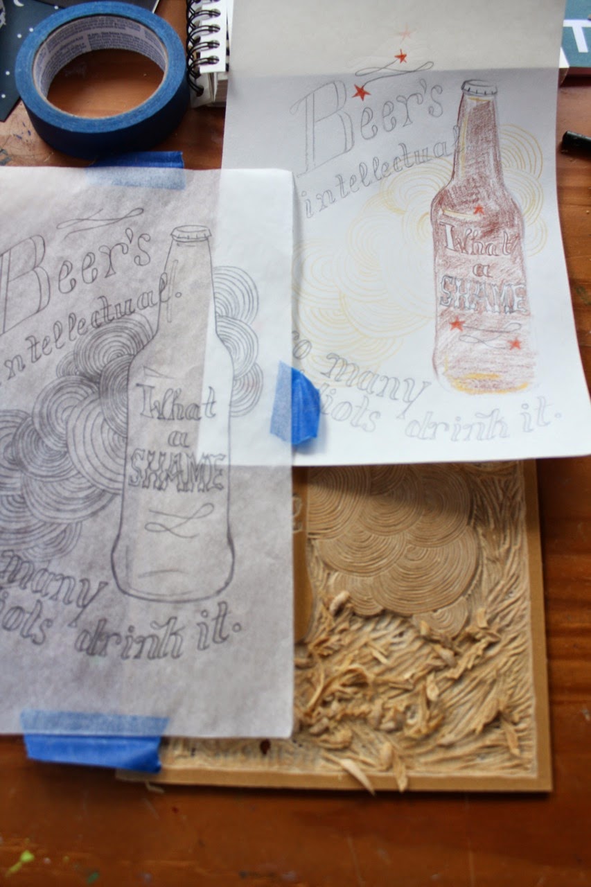

Since I wanted to use three colors, I used two plates. The first printing would be in light yellow, then I would carve out everything on the first plate I wanted to remain yellow when I printed on top in light brown. The second plate would be for the rest of the lettering. Step one, step two, step three.
Coming up with the yellow color was the hardest part of the inking process. Because my press is so small, I printed this in Mirka’s studio. I thought I mixed enough color to bring with me, but I quickly ran out. We tried to mix up some new color, but her white was a different brand and it kept coming out too orange. After trying and failing to get the same color, I eventually had to run home and grab my white ink and bring it back with me. You live and you learn, I guess!

I don't know why I didn't think about attributing the quote until so late in the process, but at the end, I had to carve out a stamp so that Ray Bradbury's name would appear on the prints.
And then.... drum roll please.... the final touch was adding these red foil stars. I can't take credit for the idea. It was Mirka's suggestion and she was right on the money because I think they look totally snazzy!
This was my first attempt at a reduction print. I had always been a little afraid of how much I would need to think through it, but this design was basic enough that it was fairly straightforward. I will definitely do more of these!
